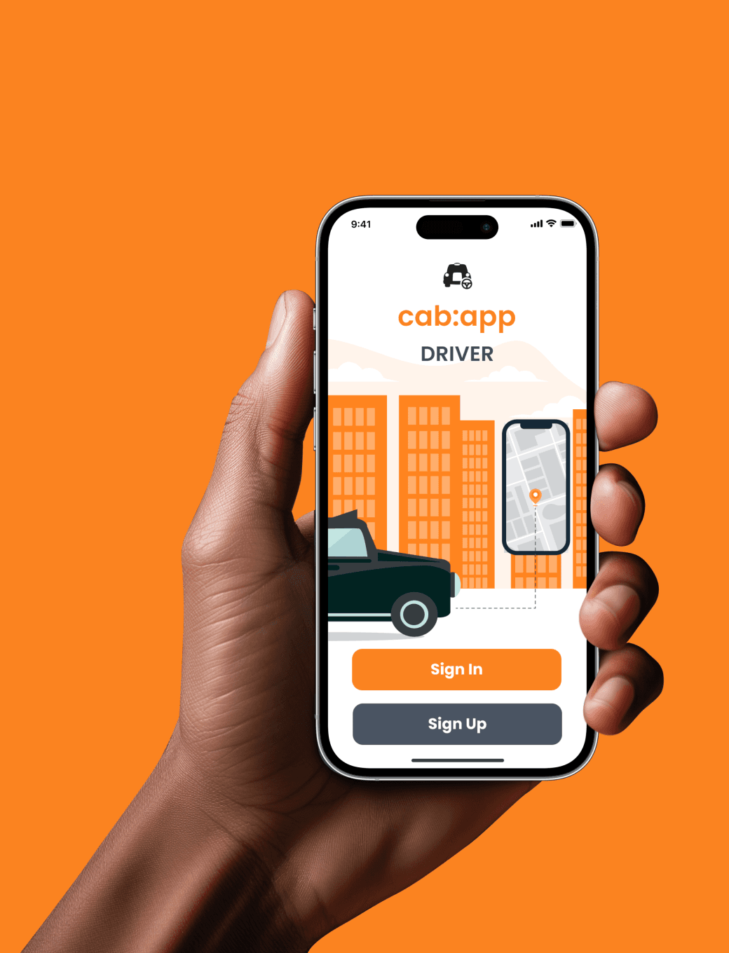
cab:app | UX/UI redesign
Category
Transport, FinTech, Payments
Deliverables
UX/UI app design, CMS
Launched in 2010 alongside the first wave of taxi apps, cab:app distinguished itself by prioritising the needs of drivers, particularly catering to an industry largely comprised of an older generation, less adept with technology.
With a network spanning over 12,000 drivers in over 90 locations across the UK & Ireland, and a decade of operation under its belt, it was due for a comprehensive UX/UI redesign to align with current tech specs. The team had a strong rapport with the drivers, many of whom were pretty “old school” and would often call or visit the office for technical support. They were vocal in providing feedback and suggesting improvements for the app, giving us valuable insights into the necessary changes required.
*While the redesign comprised of three components, this case study specifically focuses on the driver-facing app*
The Problem:
We undertook a thorough analysis of the existing iOS/Android app, aiming to evaluate its underlying architecture and functionalities, which had supported drivers for more than a decade. While we anticipated retaining a number of features, it was evident that updates and potential restructuring were necessary.
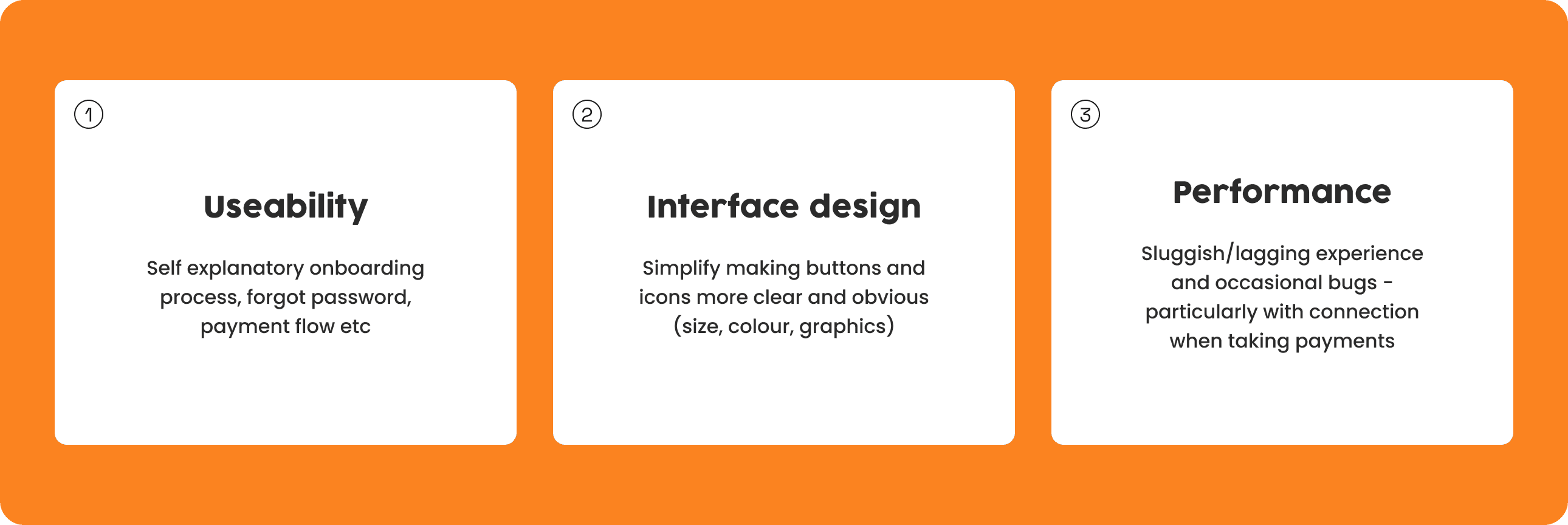
Issues we were aware of:
Sluggish or lagging app experience
Unclear or broken onboarding (approval)
Confusion stemming from obsolete features that remain within app’s functionality
Inadequate adaption of the app to newer screen sizes
Goals and objectives for the project:
> Future ready framework
> Streamlined user flow and intuitive navigation
> Modernised identity
The redesign process was geared towards achieving these goals by creating a rejuvenated app - aiming to provide an improved user experience, enhanced functionality and a more visually appealing interface to empower the users.
Restraints we were facing:
> Budget limitations for research and development
> Regulatory compliance for both UK and Irish markets (e.g. being TFL approved for London)
To tackle these constraints it was essential to engage in effective planning, communication and strategic decision making - striking a balance between project goals, available resources and stakeholder needs - all while ensuring an optimal user experience.
Research and strategy
Market research and competitive analysis:
We started off by delving into market research and conducted a comprehensive competitive analysis. With the increasing number of apps targeting licensed taxi drivers, we meticulously examined the landscape. Our focus was on understanding the offerings of competitors and pinpointing their weaknesses concerning the driver’s experience. Our analysis included Uber, Gett, Free Now and Taxiapp.
(Note: due to restrictions on access to driver apps, obtaining complete access was challenging. However, we obtained a general overview of features, functionality and UI.)
User surveys:
Next we moved to qualitative research through user surveys, which we distributed to a selection of drivers in our database. Recognising the potential reluctance of drivers to engage in online tasks, we provided them with the alternative option to share their thoughts and opinions by contacting us directly via phone.
We asked about several aspects, including:
> the current functionalities of the app and how they benefit the drivers
> Any existing limitations and what they require to better support them
> How comfortable they are using technology, assessing whether they require additional support or guidance
> If they have adopted other taxi apps or payment platforms
Conclusions drawn from the surveys and conversations:
> Typical age range spans between 40 and 70 years old
> 62% of respondents consider themselves not particularly tech-savy, even among the younger age range
> Expressed a preference for larger/clearer buttons for main features, especially when phone is mounted
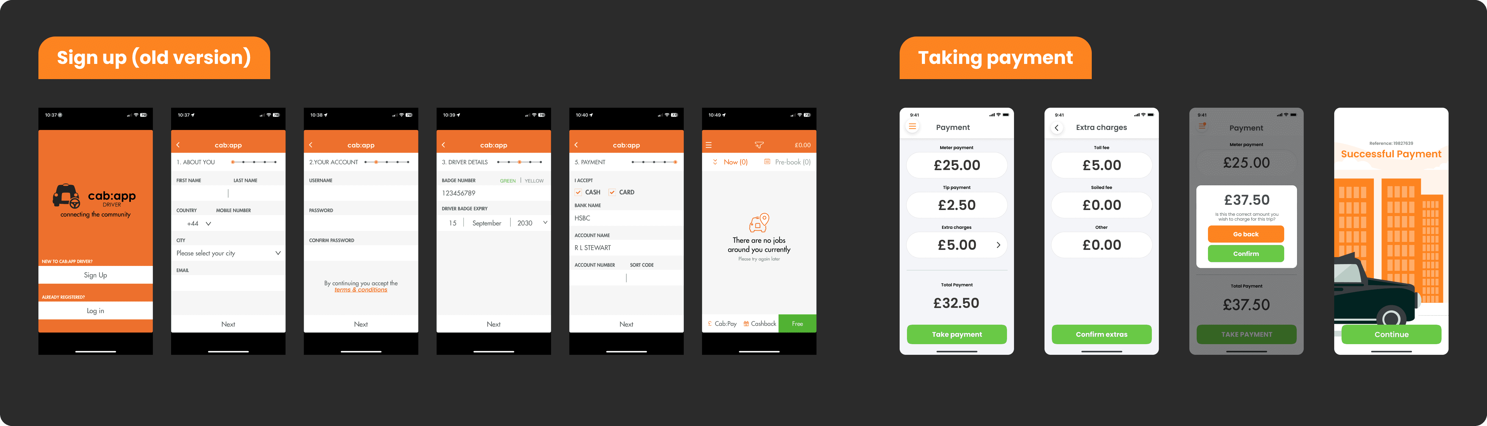
> Desire for a tip feature to be integrated into the app’s payment screen
Understanding and refining the users pain points:
Based on our research findings, we validated our initial assumptions regarding pain points experienced by the users. We then briefly outlined strategies aimed at addressing these issues with the ultimate aim of improving overall user satisfaction and driving product success.
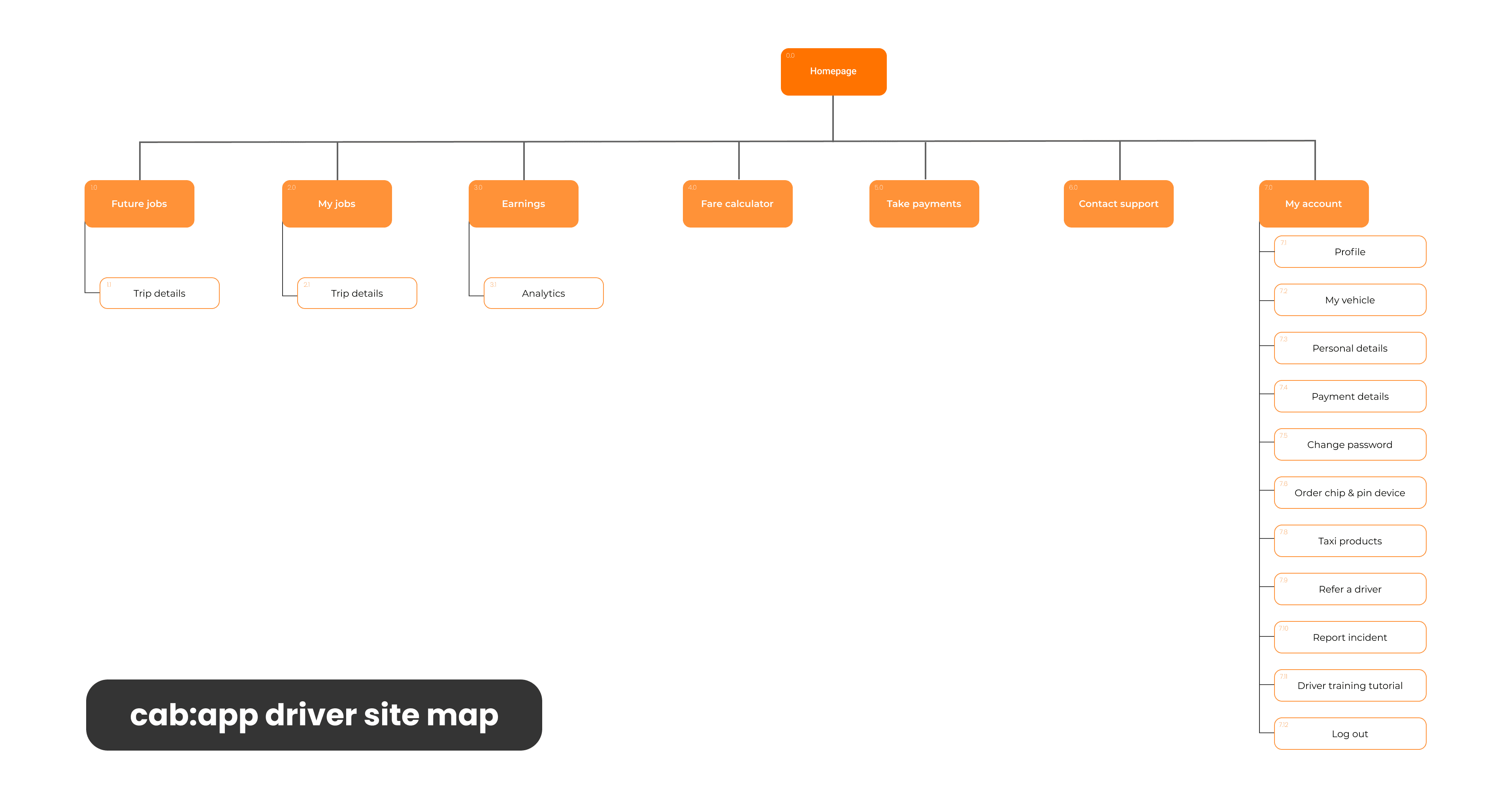
Creating user flows and sitemap:
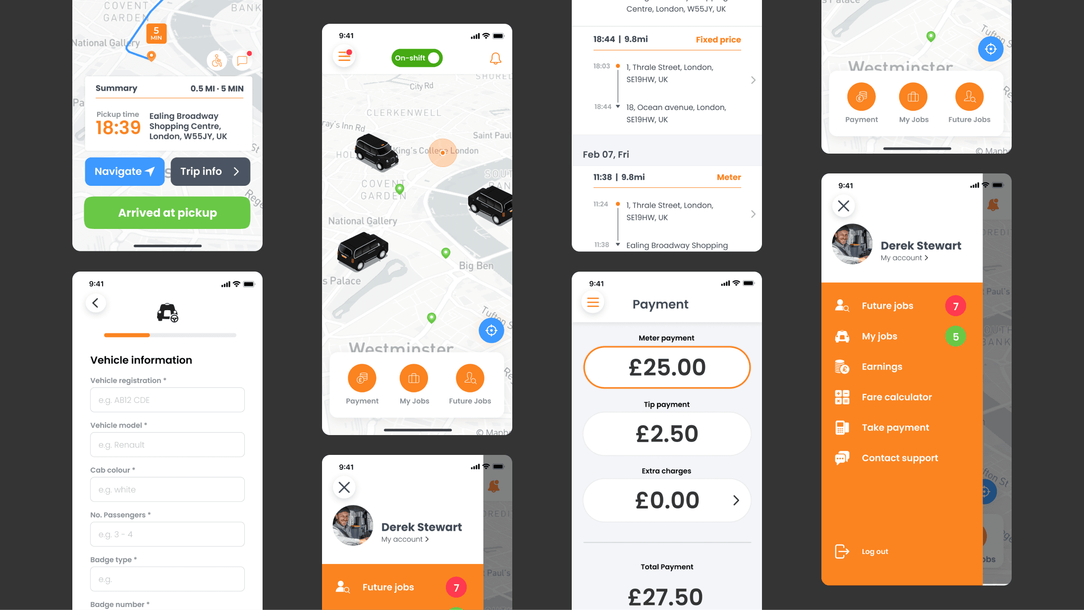
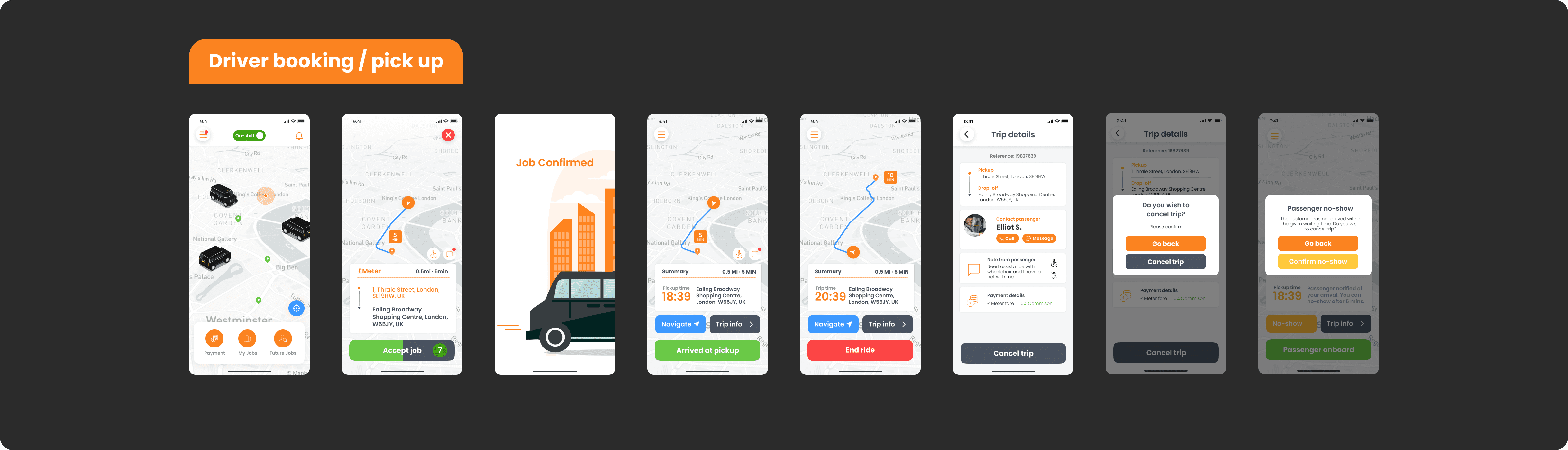
I aimed to streamline and enhance the simplicity and intuitiveness of three key user flows from the existing app: logging in, onboarding during sign up, and taking payments. Additionally I developed a sitemap for the app structure, eliminating any outdated features.

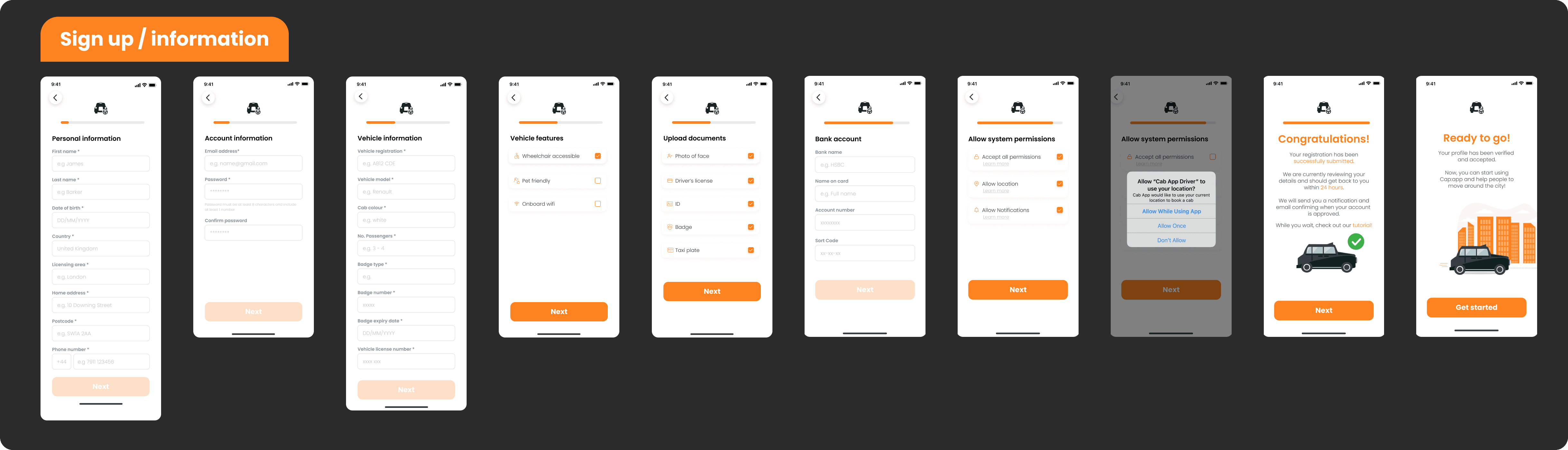
Wireframes and iterations:
Through the high-fidelity design phase, we committed to ongoing iterations to achieve our dual objectives: alleviating drivers’ pain points and fulfilling our business goals. We developed more than 70 screens, refining them iteratively. Additionally, we invited select current users to our office to test a prototype, gather feedback and adjust designs accordingly.

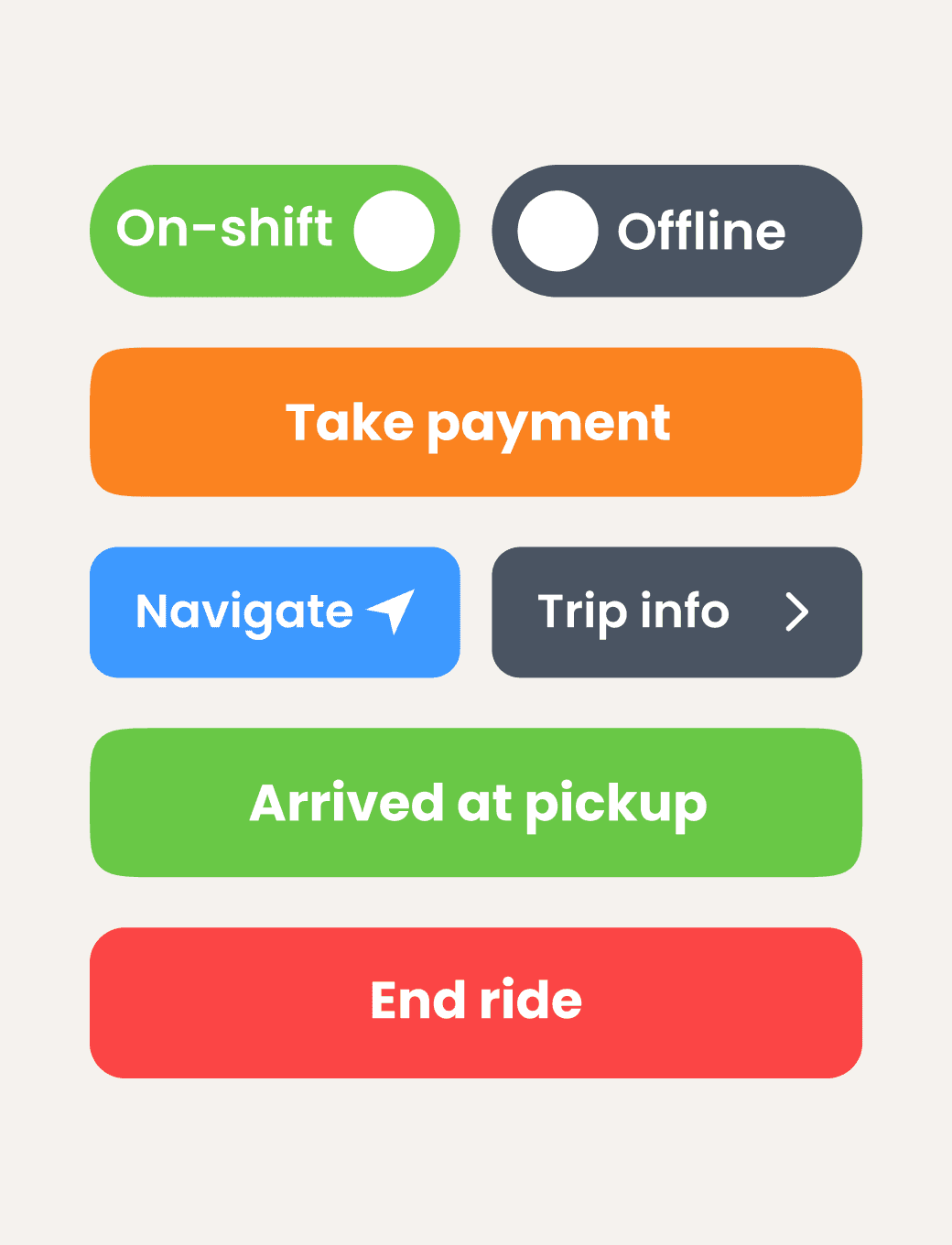
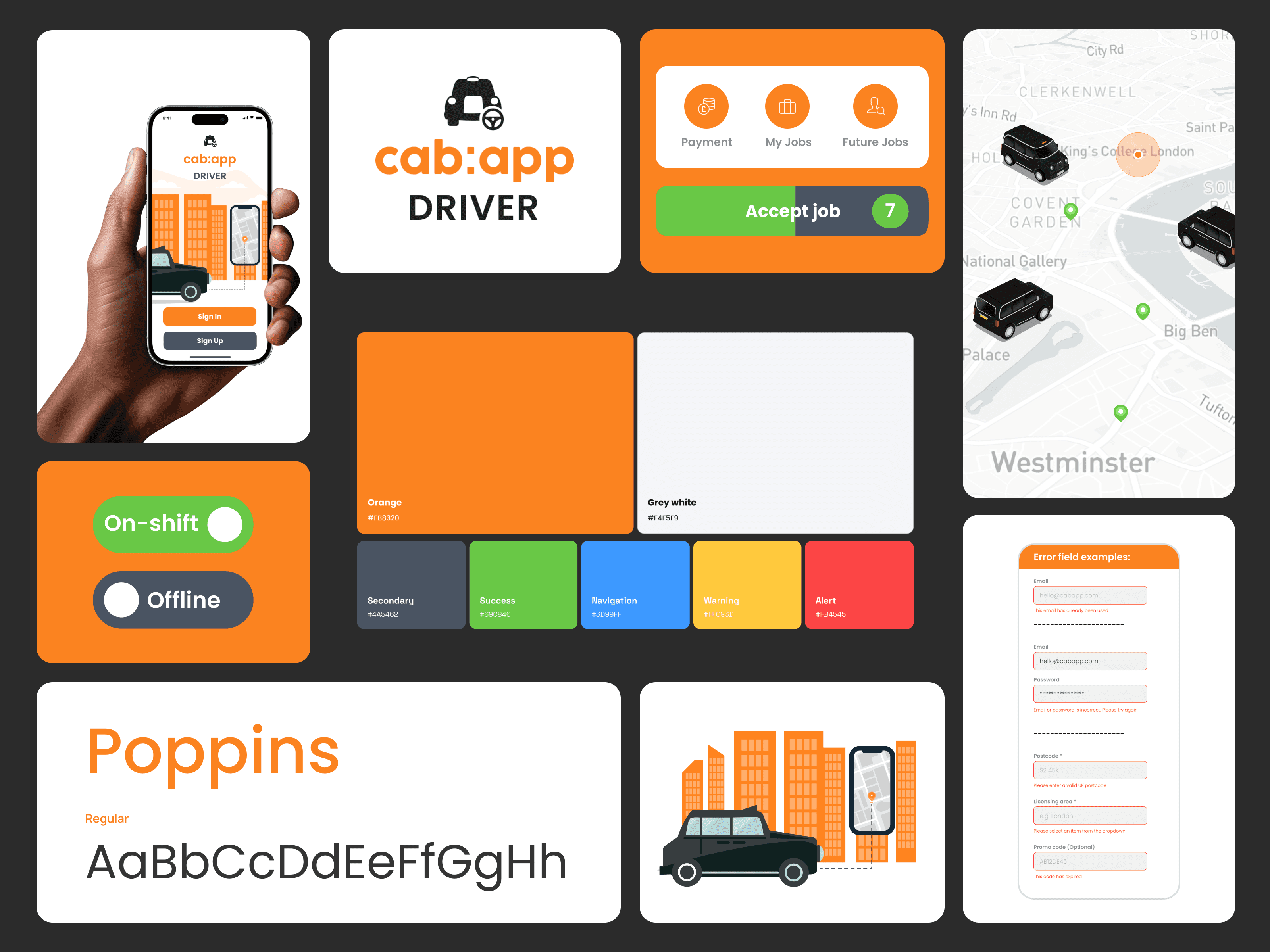
UI and design systems:
Regarding the UI design, we recognised the importance of maintaining familiarity, particularly for users of the driver app. Therefore we opted to retain a predominately monochromatic theme throughout the app and strategically incorporate bright colour and large icons/text to emphasise key features, especially for instances when users’ phones are mounted at a distance from them.
We received excellent feedback during prototype testing with users expressing their enthusiasm for the refreshed and straightforward appearance of the design.
Moving to development with Ddroidd:
Proceeding to the next phase of the redesign involved transitioning from wireframes to development, which I find both an exciting and detail-oriented process. This phase demanded various technical elements specific to the driver’s side, such as KYC/AML verification processes, geofencing and the integration of payment flows involving merchants, acquirers and processors.
Given our time constraints and business objectives, we prioritised the rollout of essential functionalities - onboarding and payments (we were aware of the time it would take to transition drivers over and let them get familiar with the new UX/UI). So, to expedite this process we divided features into two versions: V1 and V2.
I thoroughly enjoy navigating through the various phases of a project, and development is where everything truly comes together. Collaborating with developers during this phase presents a great opportunity to identify any overlooked or previously unconsidered technical aspects. Their expertise often sheds light on crucial elements that contribute to the project's success.
Next steps for cab:app:
This was just one aspect of the redesign - what followed was also the passenger app and a CMS overhaul for all of the technical aspects regarding the different cities across the UK & Ireland. This was also carried out by myself and the team.
Regrettably, during the development phase, the company closed in early 2024, preventing us from seeing the project go live after extensive testing. This outcome was disappointing, yet serves as a stark reminder of the unpredictable nature of tech development. It highlights the importance of considering business objectives and strategy, emphasising the need for careful planning and adaptability in navigating the dynamic landscape of the tech industry.